From the late 1940s to the present, Plasticville by Bachmann has been a presence in the hobby. Associated with tinplate and toy trains, I have always felt that these venerable kits deserved more respect. And I am not alone in that regard. My good friend, Jim Sacco of City Classics, maker of excellent art deco and other building kits, signs, window treatments and interior graphics, agrees. He gives a fab clinic on “modernizing” a downtown scene by among other techniques, grafting Plasticville building fronts onto plastic brick structures from DPM or even City Classics. If you are an NMRA member, I believe this clinic is available on the Members Only page on the NMRA website. I’ll mention this technique again and Jim is one of the few scale modelers I know who appreciates Plasticville.
Frankly, the many who do not is no surprise. Plasticville is somewhat unusual because “scale” is fluid with this line of simple snap-together kits. One of the kits I built for this column appears to be HO scale, but with a taller than normal front door, and an S if not O scale back door. Another has almost an N scale door. Certain kits are clearly labeled for the “S–O” market while others are HO scale. All were aimed at the toy train market with low prices, exclusively plastic parts, thick cross-sections and no-glue-required snap-together assembly. This latter feature allowed the kits to be assembled for use and disassembled for storage. So, you can see why many dismiss the line as toy-like and leave them on swap meet tables.
Plasticville was created and has been produced by Bachmann Industries, the nation’s oldest toy manufacturer, since 1947, although first advertised in 1946. Out of the box, Plasticville buildings are usually two-tone, with building walls of one color and the doors, windows and roof molded out of a different colored plastic. With few exceptions, Plasticville buildings are styled after 1950s suburban buildings, and the product line has not changed since the late 1950s, although it has been expanded.
A web search indicates the earlier Plasticville building designs were made to 1:64 scale with 1:48 scale doors, a design compromise that allowed them to be used with S or O scale train layouts without looking off-scale. This allowed one product line to serve both Lionel and American Flyer’s product lines of the 1950s. At one point, each of those companies offered Plasticville kits in Lionel or AF boxes. Later, as HO scale gained in popularity, Bachmann produced a line of 1:87 scale buildings. When interest in slot cars grew in the early 1960s, Bachmann responded in 1963 by introducing a line of road-racing accessories. A Western series was added fairly recently.
The first Plasticville product was a plastic fence, initially marketed as an accessory for Christmas trees. When Bachmann learned that consumers were using it on train layouts, they added additional accessories such as plastic trees, bushes, and bridges. By 1950, Bachmann had added houses and stores to the product line, and Plasticville quickly became the most popular brand of train buildings on the market. Bachmann added several buildings to the product line every year until 1958. While some of these buildings were of Bachmann’s design, others came from competing product lines that Bachmann absorbed in the mid-1950s. Although not all pieces were manufactured every year, the Plasticville line has remained commercially available since the 1950s.
In 1984, Plasticville, as well as the entire Bachmann line, was taken over by Kader Industries in China where the line is now produced. Modern releases use a different plastic and color scheme to differentiate from earlier collectible offerings. There are Plasticville collectors, although internet sources note that the numbers of collectors have dwindled. There have also been price guides published devoted to this line.
I have always been drawn to the classic architecture of these buildings. Much of the line is dead-on accurate for the late 1940s to mid-1950s, for that is when they were produced. For example, the Firehouse is stamped with a 1952 patent date. One of the buildings I used featured classic horizontal slat windows, typical of the 1940–50s. The S/O scale Hospital was always a favorite of mine as some releases included an interior complete with hospital beds, desk and even an operating table. Where else can you find a ¼-inch scale operating table?
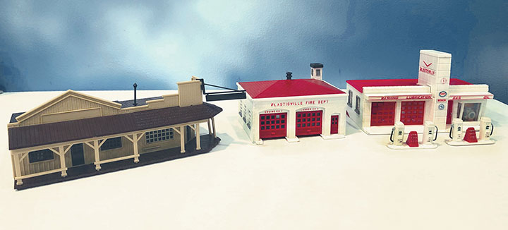
For this column I assembled and fine-scaled four kits including the Firehouse, a Gas Station (one of two designs in HO), Frosty Bar Ice Cream stand, and a post-Kader Western release, the Marshall’s Office/Restaurant. Walthers, a great source for these kits, kindly provided the latter. The others I obtained literally for a few bucks at swap meets over the years. I obtained two Frosty Bars and neither had intact lettering, among other condition issues. Often it is easier and cheaper to buy built models knowing most can be dis-assembled rather easily. Sometimes two inexpensive built versions can provide enough parts to re-build one, as with the Frosty Bar. As a bonus, I salvaged some additional parts for future projects. That is another use for these kits, a source of vintage and correct parts.
The Firehouse and Gas Station share similar side and rear walls. This was common with both kits featuring stucco texture molded into the plastic. In the case of the Gas Station, I kept the thick window frames/mullions because they were relegated to the sides/back and are typical of the era. The Firehouse window frames were kept, but I cut away the thick mullions and used printed scale acetate mullions, an old John Allen trick. After gluing the walls together, I applied Crescent Creek’s excellent stucco material over the plastic stucco and, were I not so lazy, I should have first applied modeler’s putty over the corner joints. This would have eliminated any corner seam. With new paint, the stucco looked fantastic, and with the repainted trim, 100 percent better. For the Firehouse, I painted the roof with a worn metal seam color and green shingles over-laid with a matching green weathering chalk. For the Gas Station, I applied tarpaper strips with white-glue/black-painted tar seams. I installed two Suydam vents on the roof over the 2-stall garage, and a stack in the office area.
The fronts are what make Plasticville shine. The Firehouse is a simple stucco scheme with doors that only needed painting and added styrene panels behind the bay doors, leaving a top strip of windows. The Gas Station has a ceramic art deco front with tower that is nicely done. This required a new paint job, and little else. I applied a rub-on foil stainless steel overlay on the canopy, which features lovely, raised lettering for oil-gas-lubrication. There is a card insert of an interior for the office which I left, plus I raised one of the garage doors and used Roomettes interior graphics plus a styrene floor to hint at a garage interior. Lights were hidden in the tower section base and office. I also added some paper Conoco signage, and simply repainted the slightly oversized two-pump islands that came with the kit. One of the hoses with broken nozzle will be bent near a vehicle as if gassing up the car.
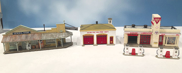
Almost all Plasticville kits come with prominently raised “Plasticville” lettering. Three of the 4 buildings had that feature. I suspect that is a major reason these kits are rejected. Yet, a simple x-Acto or similar chisel blade removes that lettering and Plastruct and Slaters (a UK company) offer suitable replacement raised lettering in different sizes. Since I hope to place both of these buildings in my proposed town of Deimling, named somewhat ironically after ¼-inch fine scale modeler, Gene Deimling, I used raised lettering to convert the “Plasticville Fire Department” into the “Deimling Vol (Volunteer) Fire Department,” thereby explaining the lack of sleeping space and the siren on the roof. Similarly, the larger “Plasticville” on the Gas Station tower sides was replaced with raised “Deimling Gas” lettering. “Conoco Gas” would be another option.
The Western Building is newer with no Plasticville lettering. However, it features the same thick windows/doors, simple assembly and toy-like appearance of the earlier kits. Yet the wood board-and-batten and plank siding is well rendered, as is the wooden roof and walk. The Marshall’s office has a nice two-cell stucco section in the back with barred windows. I applied the Crescent Creek stucco there, and repainted the rest of the siding in two slightly different colors. I replaced the front and side windows with modified Grandt Line windows, and also new doors from my scrap box. The shiny plastic wooden-plank roof and walk were painted first with a neutral buff colored craft paint, then a wood-color stain, and highlighted with dry-brushed light gray. The same treatment was given to the plastic porch roof shingles. The porch roof remainder was covered in weathered corrugated. The main roof received different colored seamed tarpaper from CC Crow for each storefront. I cut a few “holes” in the tarpaper to show the weathered wood planks underneath, a very effective touch. I also added a new stack on the General Store roof portion.
The thick plastic porch post assembly served as the template for a wood replacement. The new porch posts hid the holes in the porch walk designed for the original plastic tabs. I added new signage including cutting away the bulky Marshall’s sign bracket but retaining that sign. I added a roof finial where the bracket would have been. I converted the “Chuck Wagon” restaurant into a General Store with signage, and by adding details to the porch. I also added window treatments, but no interior. There is no floor, so lighting will be easy. The result is surprisingly effective, and I chose to decorate the building as being in good shape. One could further weather the building, however.
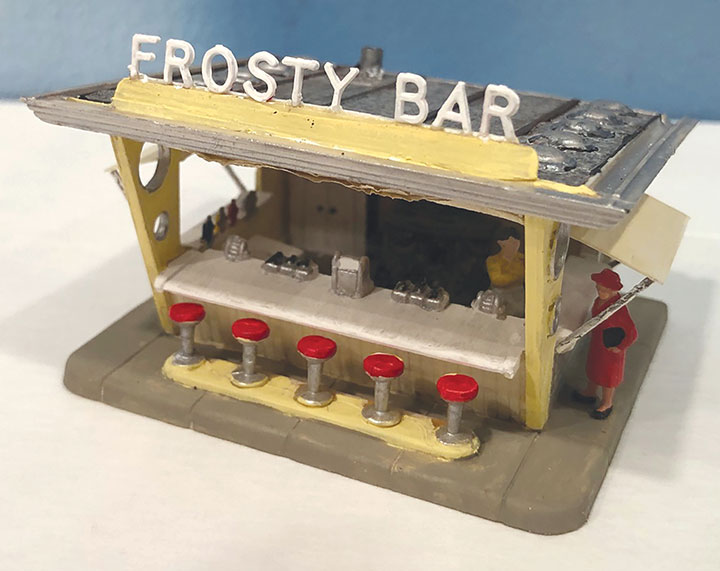
Finally, the Frosty Bar is an architectural gem. Art Moderne wings frame the small open-air structure with three counters featuring cast-in details like ice cream bins, condiment bottles, and cash register. This model needed cleanup, repainting and the addition of more interior fittings to convert it into a burger/ice cream stand. I added some of my 45 year-old State of California mottled gray carbon paper tarpaper in strips working it around the vents and stack. Styrene side awnings and front rolled canvas screen (tissue paper) help in winter. The small raised “Plasticville” lettering was sanded off the sign frame and I replaced the Frosty Bar lettering as a few letters were missing. To ease application, I doubled the sign base thickness. Finally, I added some figures.
There is one more class of buildings not pictured here, but mentioned in Jim Sacco’s clinic. These are the storefront structures with wide classic art deco fronts and narrow sides. The Post Office, 5&10, Hardware Store, and Supermarket fit this category. Jim discards the sides/back and grafts the storefront onto other, often multi-story kits. The results are very effective. Again, you can modify or replace thick windows/doors and eliminate/replace the “Plasticville” lettering. But the art deco features are well executed and worth saving.
If you examine my before and after photos, I admit the results are not dramatic. But I suggest these little structures fill a need and are an economical option. I hope you will give them another look to see what you might create, and thereby, also honor the heritage of our hobby.
Well, that’s all for now, until next time — write, if the mood strikes.